How Apple nailed the GUI—Years Before the Mac
Apple’s user research for Lisa refined menus, scrollbars, copy-paste, and more.
GUIs from before LISA
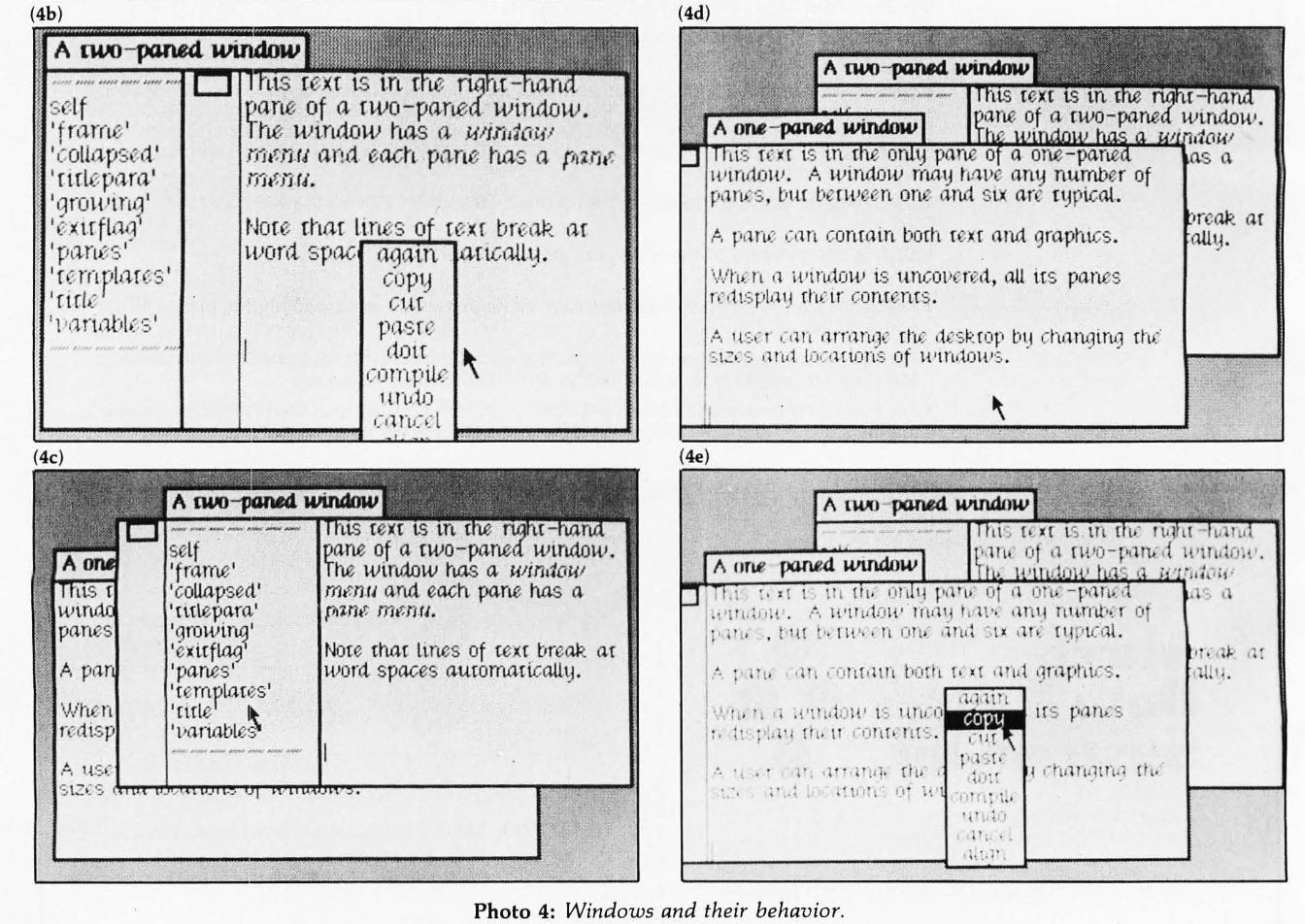
Xerox Smalltalk already had rectangular overlapping windows, titled tabs, scrollbar without arrows, two panel windows, pop-up menus, and hover states.
Project Lisa
It wasn’t just some easy-to-use computer, it was an easy-to-use computer for specific people. Non-technical, non-analytical people. First-time users. In 1980 there were a lot of first-time users like administrative assistants and secretaries. Secondarily, managers, accountants, and executives.
It wasn’t for programmers, it wasn’t for kids, it wasn’t for people at home doing recipes. The Lisa was an office system. It’s “a single-user workstation designed to enrich the productivity of the office workers” — so our market was office workers.
The Lisa wasn’t intended to run thousands of applications. John Couch, said, All I want is… to be able to go into a spreadsheet, put some numbers in, go and graph them, take the graph, put it into my word processor document, and include it in a report. He said, then we’ll be way ahead of anything available on the Apple II, where there are all these separate programs that don’t interact with each other. Whenever we brought him any issue, he said, Remember what I want, and he went through the whole mantra; and that was a very healthy thing: it kept us focused, and then we also knew when we were done.
4 key features
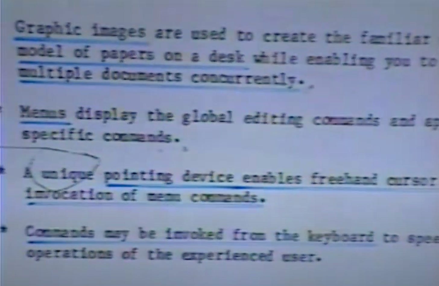
Graphic images, menus, pointing device, and keyboard shortcuts.
📅 Aggressive user testing schedule
Enter Larry Tesler — I was told the day I got there that the user interface design was basically done, and they were just going to write it up, finalise it, and implement it.
18th July - the decisions had to be made by the 23rd, and by one week later the ‘external reference specification’ had to be done, but we couldn’t compromise quality at all.
I started explaining how it was necessary to do months of user testing and careful iteration, and I gave my whole spiel about the right way to design software.
Well, sorry, we only have five days into the weekend in there…So we came up with an aggressive schedule:
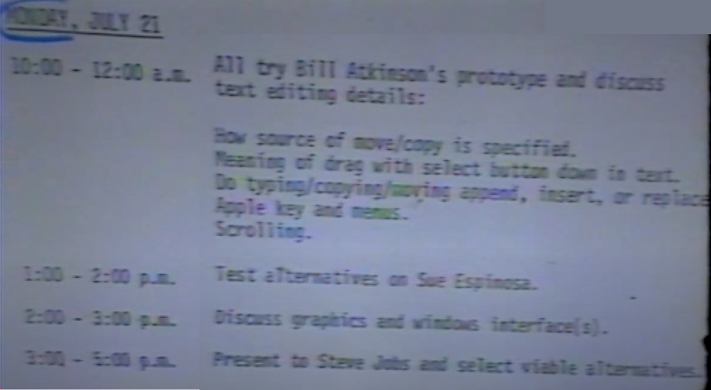
This approach becomes a core part of developing the UI for the next couple of years of Lisa’s development leading to the user-friendly we still use today!
🖱️ Mouse (Number of Buttons)
Initial Idea:
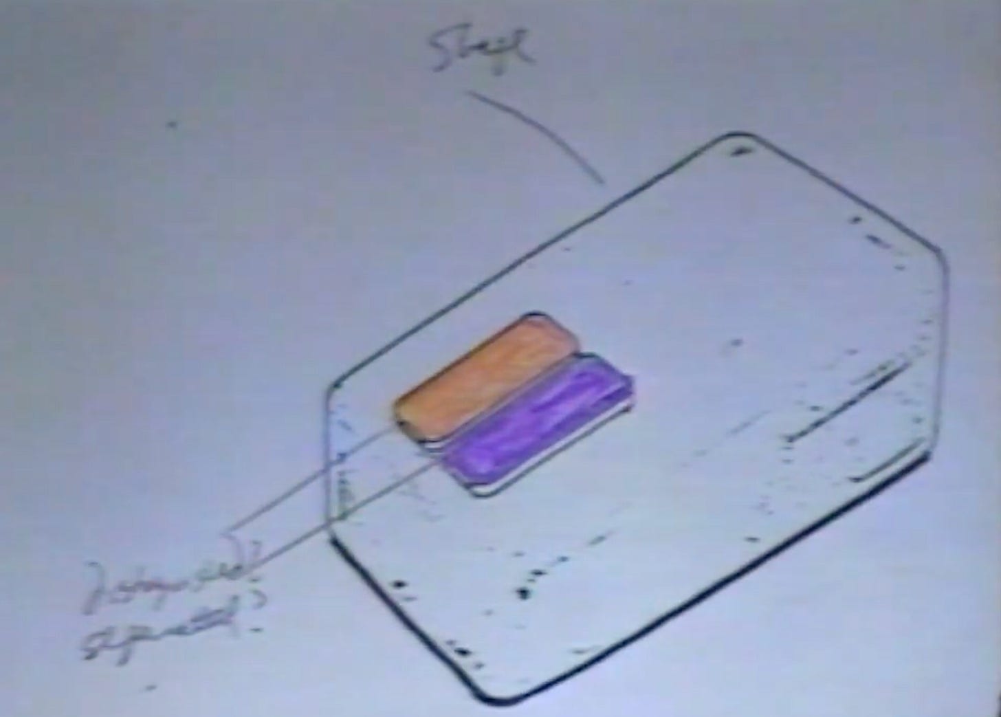
Two-button mouse (Point and Grow buttons).
Click and drag behaviors for windows.
Testing and Iterations:
Early tests showed users confused by two buttons.
Unclear purpose and naming of the two buttons.
Feedback:
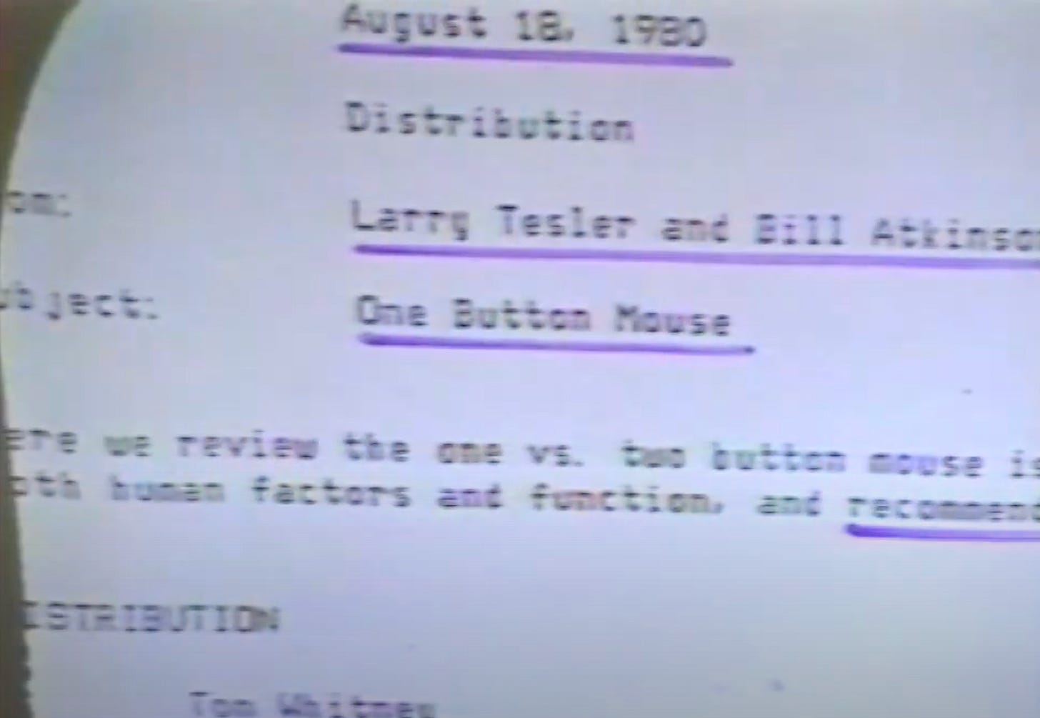
Larry Tesler strongly pushed for one button — simpler for users.
Trip Hawkins (head of product marketing) loved it for being more consumer-friendly.
Some engineers worried about losing functionality.
Final Decision:
Switched to one-button mouse (August 1980).
Reason: cheaper, simpler mentally, easier to teach, future proof for touch devices.
🪟 Windows (Movement, Resizing, Collapsing)
Initial Idea:
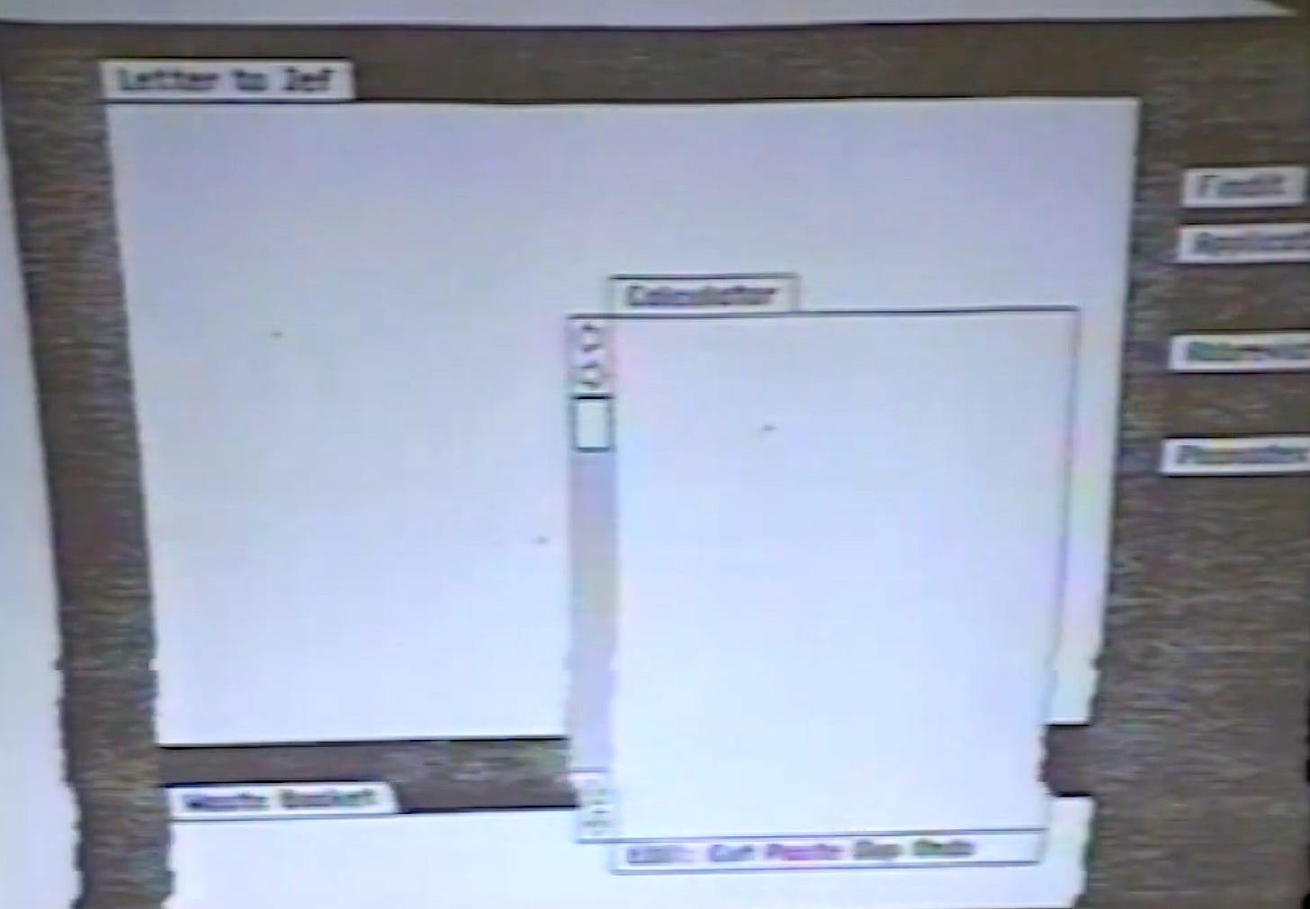
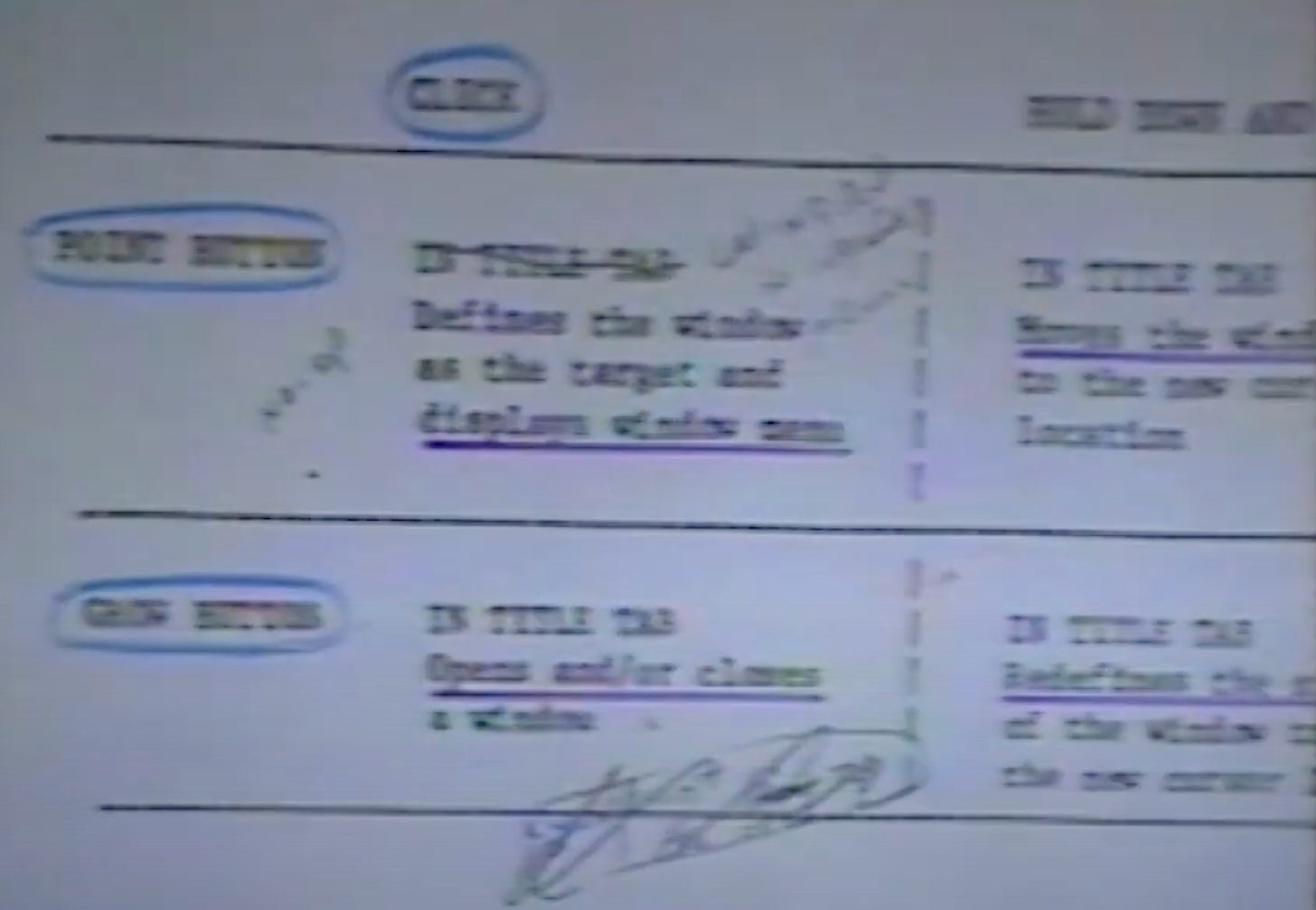
Windows had tabs at the top for title.
Window operations (move, resize, open, close) done by clicking/dragging the title area.
No grow box — resize by clicking title tab and dragging.
Testing and Iterations:
Realized resizing from title was confusing.
Needed a more intuitive way to resize.
Feedback:
Ken Victor: Should allow resizing from any side, not just title or bottom-right.
Larry Tesler proposed a grow box at bottom-right.
Final Decision:
Added a grow box at bottom-right for resizing windows.
Did not allow resizing from all sides due to complexity and screen space.
Other Window Features:
Later added the concept of collapsing windows to tabs (early ancestor of Mac OS 8 tabbed windows!).
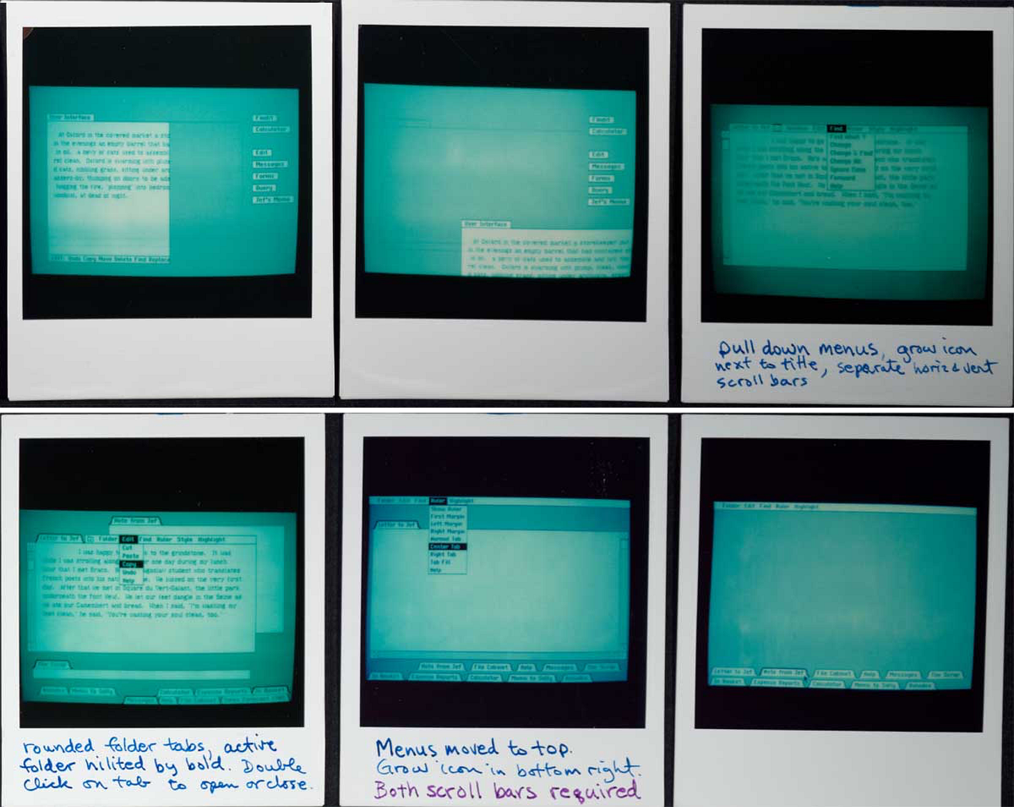
📜 Menus (Location and Behavior)
Initial Idea:
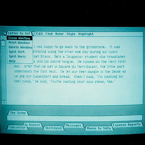
Menus attached to individual windows (like Smalltalk and early UCSD Pascal apps).
Bottom of the window initially.
Testing and Iterations:
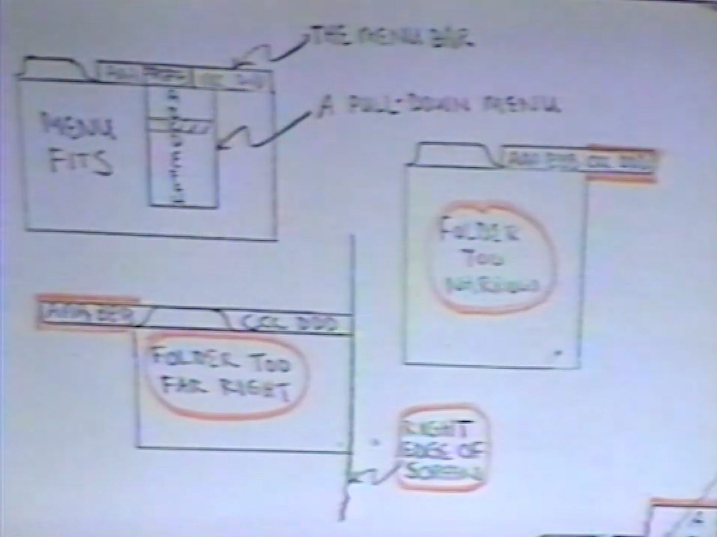
Problems when windows were small — menus would stick out awkwardly.
Made it hard to have consistent commands.
Menus could cover content user was trying to act on.
Feedback:
Larry Tesler proposed global menu bar at top of screen (August 18, 1980).
Bill Atkinson implemented full menu bar at top of screen overnight.
Barry Smith liked menus at the top much better.
Gail Pilkington (publications) initially disliked pull-down menus (blocked content).
Final Decision:
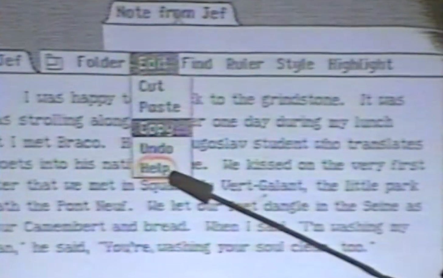
Menu bar at the top of the screen, with pull-down menus.
Menus popped down vertically.
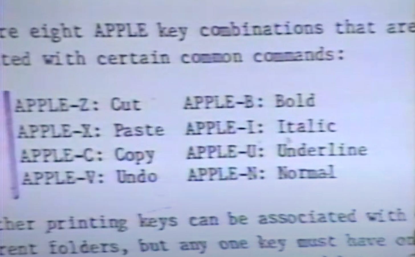
Command keys added for frequent actions (e.g., Cut, Copy, Paste).
Scrolling in menus came much later - in the 1990s. They avoided having scroll to discourage users from putting too many options in there.
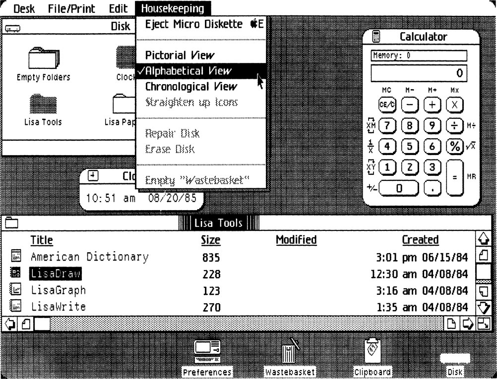
💡 Dim Highlighting
1. First Introduction
When: August 22, 1980
What: Menu items that are not currently available are shown in a lighter or "dim" shade instead of being hidden.
Why: To give users a consistent menu layout, even if some options aren’t usable at the moment.
Source: Revised version of the user interface spec. Larry Tesler and Bill Atkinson.
2. Dual Purpose
Also used to indicate toggle states (on/off).
Example: Dim for “off” and bold for “on.”
3. Problem
Issue: Using dimming for both disabled items and toggles was confusing.
Resolution: Later, toggles switched to using checkmarks, and dimming was kept only for unavailable items.
4. Criticism from Publications Team
Who: Gail Pilkington (from the documentation team)
Viewpoint: Thought dim highlighting was ugly and confusing.
Suggestion: Just suppress unavailable menu items instead of showing them dimmed.
Rationale: Dim items covered up content and weren’t intuitive.
5. Outcome
Despite critique, dim highlighting remained — but with clearer visual distinctions (e.g., checkmarks for toggles).
🧹 Cut/Copy/Paste vs. Move/Copy/Delete
Initial Idea:
Proposed to use Move/Copy/Delete/Transpose instead of Cut/Copy/Paste.
Testing and Iterations:
User testing showed Cut/Copy/Paste more understandable.
Users preferred temporary "wastebasket" (clipboard) idea.
Feedback:
Ken Victor and others proposed Move/Copy.
Larry Tesler argued strongly for Cut/Copy/Paste based on ease for non-technical users.
Cut/Copy/Paste easier because users didn't have to see both source and destination at once.
Final Decision:
Cut/Copy/Paste wins.

↔ Scrollbars
Initial Idea:
Scrollbars on the left side of the window.
Two arrows: horizontal scrolling at top, vertical scrolling at bottom.
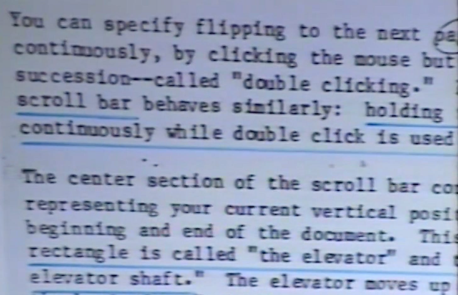
On adding the horizontal scroll, the elevator changed to being called the thumb.
Testing and Iterations:
Click to scroll, hold to scroll continuously.
Experimented with double-clicking to "jump" a full page.
Feedback:
Ken Victor: suggested live scrolling (as you drag).
Rejected — processor too slow.
Larry Tesler: suggested flipping the arrows to match text movement better.
Testing on real users showed the simpler model worked better.
Final Decision:
Scrollbars stayed simple: arrows scroll, thumb moves content.
Live scrolling deferred to future (too slow on Lisa hardware).
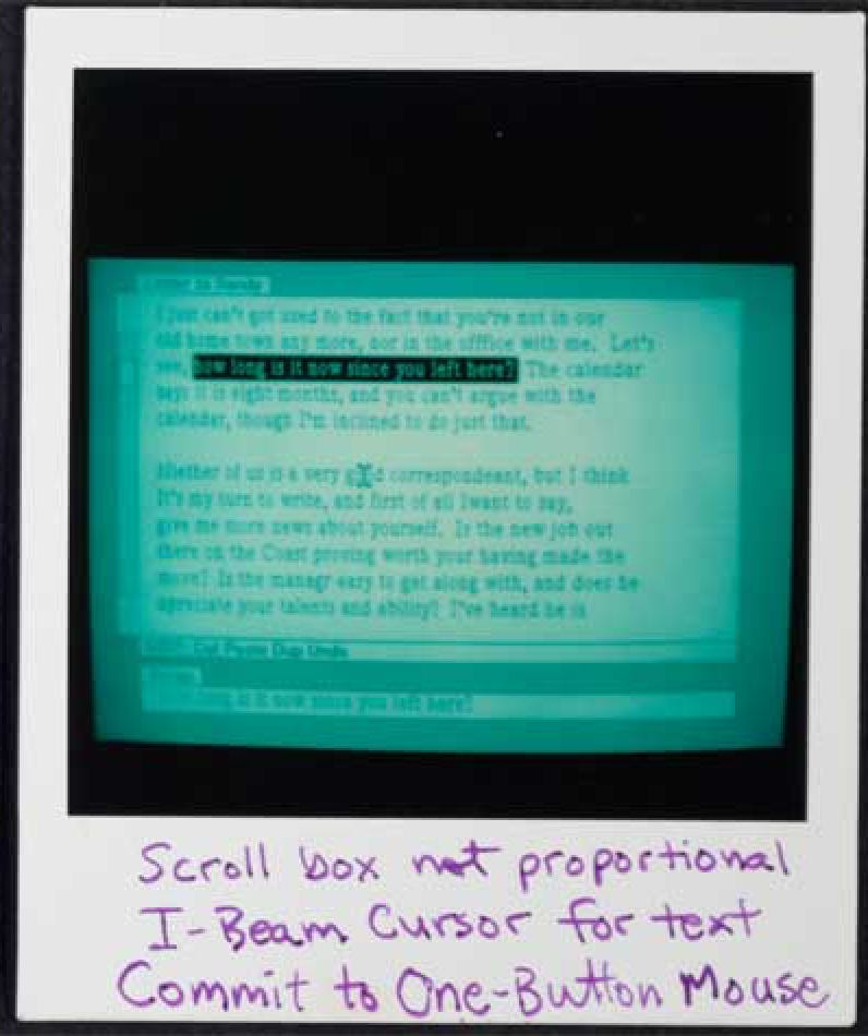
✏ Text Cursor and Selection
Initial Idea:
Regular arrow cursor even in text selection.
Testing and Iterations:
Larry Tesler proposed i-beam shape for text selection.
Feedback:
Greg S. and others found the typing cursor obscured new text when typing.
Suggested cursor should disappear while typing. There was no way to get rid of it in the software - but he didn’t know that. And so he suggested it, and it was implemented.
Final Decision:
I-beam cursor for text areas.
Cursor disappears during typing to avoid covering letters.
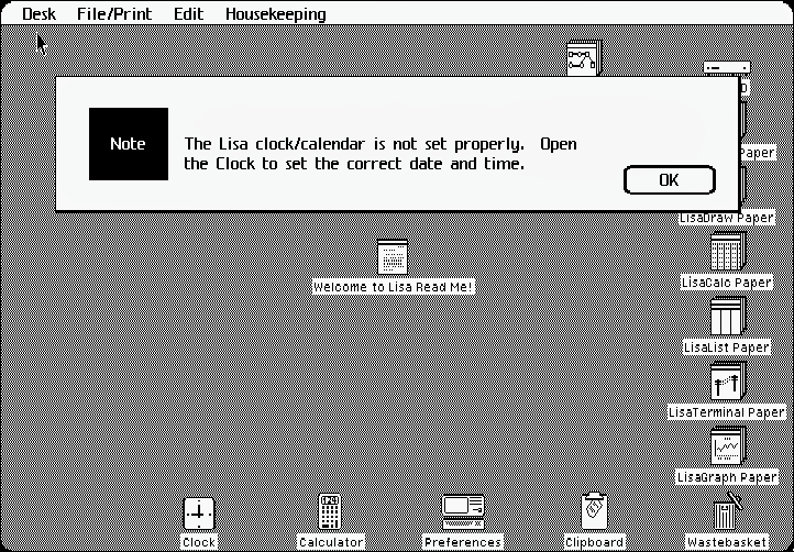
⚠ Alerts (Error Windows)
Initial Idea:
"System error windows" would pop up when there was a problem.
Testing and Iterations:
Question whether system froze during error windows.
Decided these windows would be modal — user must dismiss them.
Feedback:
Some worry over being modal, but accepted due to simplicity and safety.
Final Decision:
Modal alert boxes with beeps and messages.
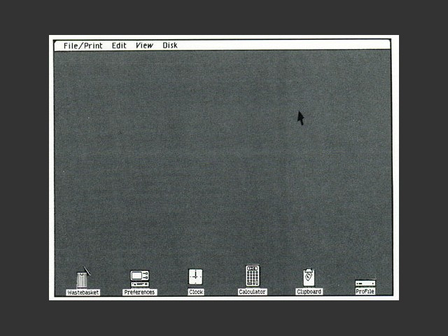
🗄 Filing System (Icons vs. Lists)
Initial Idea:
File system shown as lists (like UCSD Pascal "find file").
Testing and Iterations:
Xerox Star showed desktop icons idea.
Secret internal project started creating an "iconic filer" on weekends.
Feedback:
User tests: no usability difference between lists and icons.
BUT users emotionally preferred icons because they were more visual and fun.
Final Decision:
Switched to desktop icons despite no functional advantage.
🏷️ Terminology & Labeling
Who: Ellen Old, Larry Tesler
How Tested: Multiple user tests on menu names and terminology (e.g., File, Edit).
Outcome: Created early UX terminology standards still in Mac/Windows today.
If you’re trying to name things, you don't just say “what would you call this…” people get paralyzed like oh you're asking me to invent a name they just get totally paralyzed they can't think of a name but do you
say something like “if someone were to bring you this if you wanted someone to bring you this what would you say bring me the…” and then people would come up with something it actually worked pretty well.
📦 Setting up the LISA in 10 mins
Could someone unbox, plug in, and use the Lisa with no help?
Result: Average time to get started was ~10 minutes.
Significance: This was a win — and they treated it as a baseline benchmark for future products.
Outcome: Inspired later emphasis on the Mac's out-of-box experience.
Anecdote: Years later, when setup time crept up to an hour, it triggered a fresh round of tests to fix it.
📚 Manuals as a Design Feedback Tool
Used manuals and mockups to critique the UI — particularly menu systems.
Gail disliked dim highlighting, saying it was confusing and blocked the content users were trying to access.
Outcome: Pushed for simpler, more intuitive UI. Also led to eventual replacement of dim highlight for toggles with checkmarks.
🎯 The Craft of User Testing
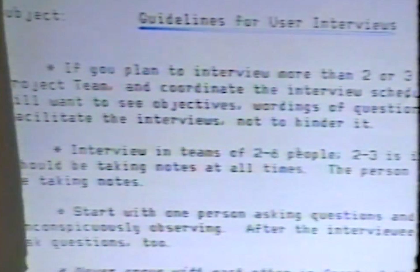
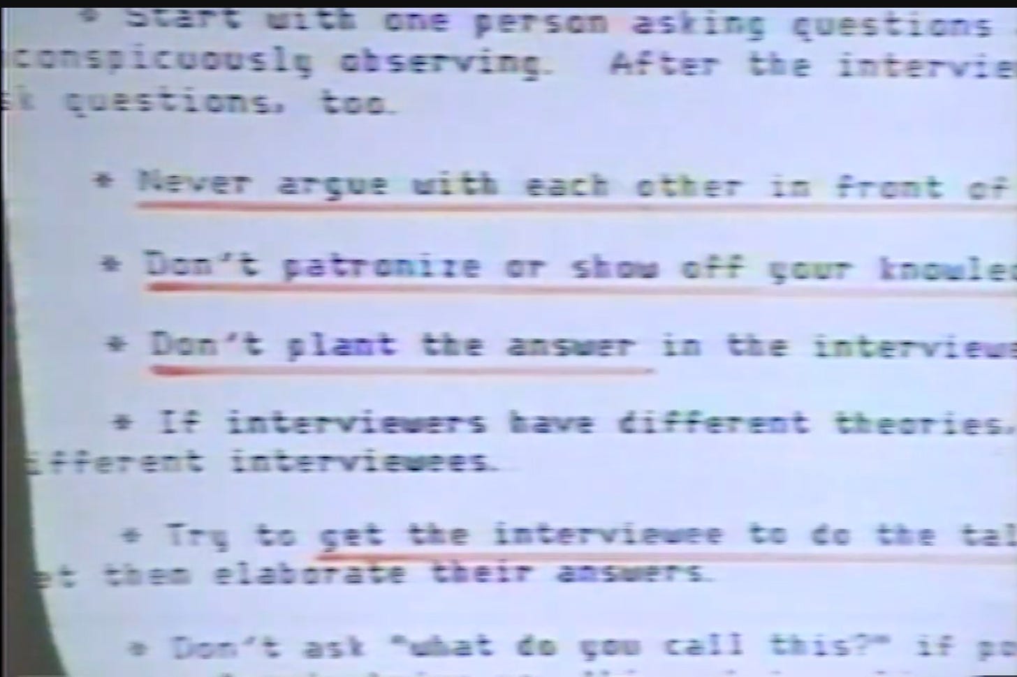
Set ground rules for engineers during user tests:
Don’t argue in front of users.
Don’t show off technical knowledge.
Don’t “rescue” users mid-test.
Let the user talk — watch their body language (sighs, squints = red flags).
Why: Engineers often couldn’t resist jumping in to help, which skewed the test.
Anecdote: Larry said he had to ban engineers from leaping out of their chairs and grabbing the mouse when a user struggled.
Outcome: More authentic feedback, fewer leading interactions.
👥 Recruiting Test Subjects
Early tests used new Apple hires — often on their first day — because they were naïve users and conveniently available.
Eventually moved to external participants, tested behind one-way mirrors.
Anecdote: Apple sometimes pulled people straight from orientation to test Lisa.
Outcome: Realized internal bias and limited diversity; blind external testing produced better data.
🧩 Navigating Politics with Data
Issue: Early interface decisions were at risk of being derailed by internal politics.
What happened:
A "User Interface Council" was formed to decide UI issues — comprised of finance and sales leaders, not designers or researchers.
Outcome: It barely functioned. Engineers were frustrated.
Solution: A more practical setup emerged — engineers and designers would test, product marketing would approve.
Anecdote: User testing became the team’s weapon against opinion-based debates. Larry Tesler described how testing helped “overwhelm the committee with facts.”
Verge Retrospectives
Hope it was as much fun reading for you as it was learning and writing for me. I might do some more Apple lore articles from the various materials I’ve come across. Drop me a email, comment or a DM if you’d like anything specific, and I’ll try.
Thanks for reading!


